Hello Eorzeans! I trust you’ve been practicing with that handy “camera” of yours since our last installation of Shroud Snapshot, and getting accustomed to the GPose settings available within the game. In today’s tutorial, we’ll be taking a step back from the technical menus and controllers and taking some notes from photography as a whole to give you even more tools that will help you on your way to becoming a skilled photographer (even if its only in-game).
While these concepts and principles are helpful, they are by no means set in stone — a good photograph may possess only one or even none of the following. Rather, we’re gonna use them as suggestions that you’re free to use or ignore. Think of them as additional tools in your work bench, available to you whenever you need an idea to help solidify that perfect picture.
Composition
You are already very familiar with composition, even if you aren’t aware of it. Composition refers to the arrangement of elements in an image, or in layman’s terms: how something looks. The Rule of Thirds is one way to create an interesting composition, but it isn’t the only way. In fact, there are a near infinite possible number of compositions , but in the world of photography, the number of these that viewers find visually appealing is reduced considerably. For our purposes, we’ll be looking at a few prominent types: minimalist, centered (and symmetrical), as well as diagonals.
Note: These aren’t really official composition types, rather than explorations of the different concepts that make up artistic composition (or can define a composition), so think of them more as means of describing works you come across or make yourself.
Minimalist composition prides itself on simplicity — it isn’t complicated or cluttered. Most commonly, you’ll find it in landscape photography, but its principles are often favored in portrait and action photography as well. By keeping the image simple, it’s easier to gleam the narrative of the picture and appreciate its aesthetic beauty.
Symmetrical composition, however, focuses on the idea of balance. To be specific, it focuses on if the image is balanced or not. Think of a seesaw. If you place two identical objects on both sides, it will sit at rest. If you remove one of the objects, the weight veers to the side the object is on. Images are somewhat similar, except instead of objects, it deals with focal points that draw our eyes to them.
Commonly, when an image is centered or symmetrical, it appears more stable and calm to us. Asymmetry, on the other hand, generates interest towards the side or section with more visual weight. Both have their place to be used, depending on the feeling you wish to evoke through your photos.
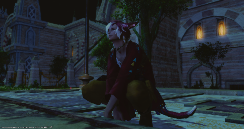
We can easily see both minimalism and symmetrical balance in this photo. There’s not much to detract our attention from the focal point of my character, and he’s positioned in the center of the image, leaving both sides balanced with equal amounts of visual weight from the background assets.
Lastly, we come to compositions built around diagonals and triangles. Did you know we often see the world in triangles? Well, not really, but we often group items we see by 3’s, which make triangles really powerful ways of arranging the elements in your photographs. And by the nature of the triangle, we inevitably achieve diagonal lines, which suggest movement and keep us engaged with the image. Consider action shots or group portraits, and you’ll quickly begin to notice the invisible triangles that have been holding your focus for so long.
Rule of Thirds
If you’ve taken an art class before, the Rule of Thirds may be a familiar concept. If you haven’t, don’t worry! It’s really easy and only requires a bit of training your eye to recognize it in use, and in turn to use it in your own work.
The Rule of Thirds is a principle that believes ideal composition is divided into thirds both horizontally and vertically, with focal points (points of visual interest) placed at the intersections of these dividing lines. To demonstrate this, look to the graphic below:
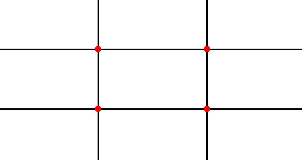
As you can see, the Rule of Thirds divides the photo into 9 sections along 4 lines. These 4 lines are where you optimally wish to place elements of your photos, while the 4 points are the strongest for visual interest. This is because the human eye finds it uncomfortable to settle on the center of an image, and naturally migrates to one of these intersecting points. As such, when items are placed in that position, we visually interact with it much easier than we had before.
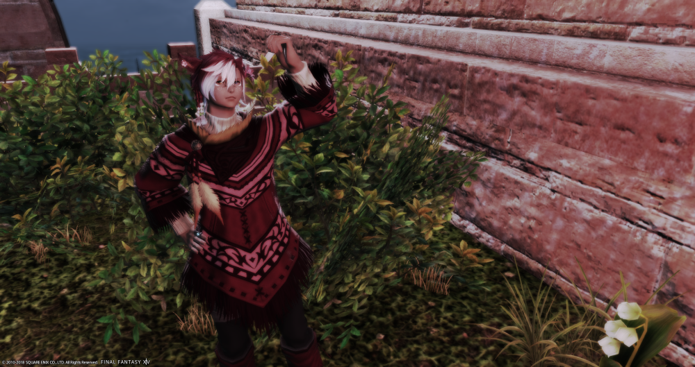
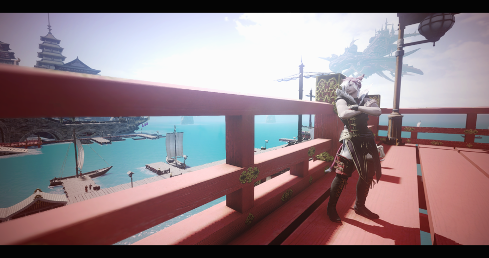
Furthermore, to see it in action, let’s look at screenshot I used as an example of asymmetrical composition and overlay the grid.
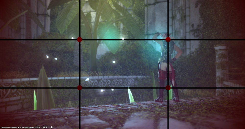
I placed my character to hang on the right side of the image, but still on the line of interest. If I had placed him in the center, it would have looked awkward and cluttered, given that his gestures look to the left, and therefore the camera would have cut off the fireflies in the background.
You can also use the Rule of Thirds for landscape photography, as the concept is to line up the horizon line with one of the horizontal division lines. Just look around, look at other photos, and see if you can find the lines yourself!
Depth of Field / Focus
But we covered the depth of field tool in the last lesson! We did, but the depth of field tool is so much more powerful than what we get in the extended GPose settings. In fact, in the future, I’ll be introducing you to an add-on that will let you use Depth of Field to its true potential, if you’re a PC player. For now, though, let’s look into what exactly it is.
Depth of Field refers to shifting focus between the foreground and background. It creates the illusion of depth, as if the image is deeper than pixels on a screen or on a sheet of paper. You could say it makes an image more “real” or “cinematic,” depending on how it is used, but it actually just plays tricks on your eyes.
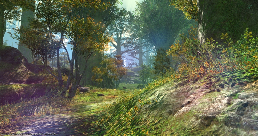
But when do we want to use depth of field? Constantly! Focus brings the important parts of the image to the forefront and lets them shine! Without focus, our eyes don’t know where to linger and analyze, which can lead to some cluttered compositions. Compare these images and ask yourself what was the first thing your eye was drawn to:
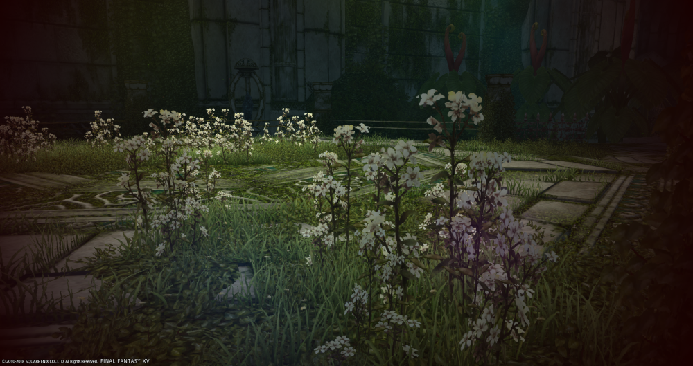
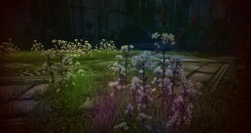
It’s really different, right? In the top photo, my eyes tend to focus more on the group of flowers in the foreground, but in the second, they tend to focus on the flowers in the background. It could be the opposite for some, though, as I presented this in a spot-the-difference sort of way, so let’s try a singular example as well.
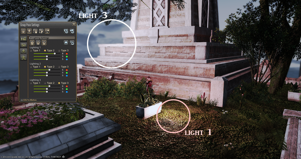
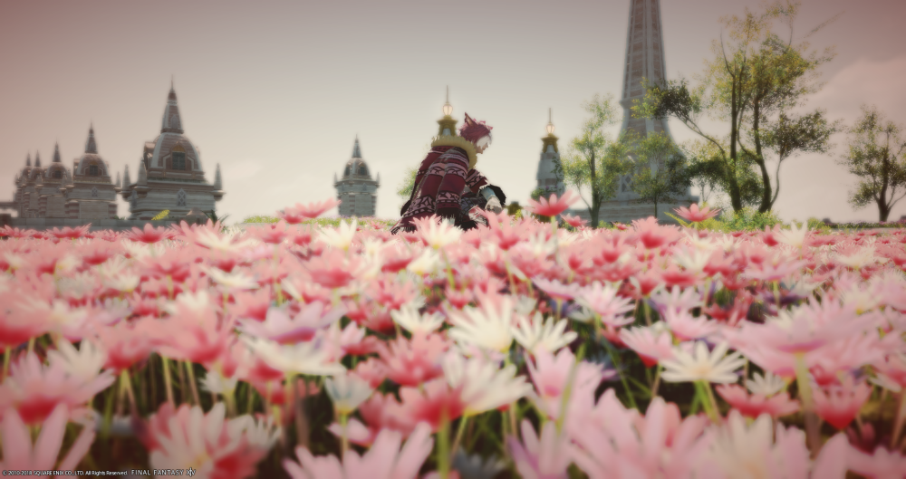
In this photo from last week, where is the first place your eye goes to?
For me, it’s my character’s face, and then to the lights on the right side. This is for two different reasons. First, we often look and focus on things we find familiar, like a human(-esque) face. But secondly, he’s the part of the photo most in focus. Without him there, our eyes would immediately go to the lit up window, as it is the part with the most visual contrast in the photo.
The same effect could potentially be made by blurring an image in Photoshop, but why do work in post when you can get the effect from the start? With an actual camera, the way we refer to this effect is by the f-number or focal number (also called an f-stop) the camera lens is set to. Inside the world of Final Fantasy XIV, this specific terminology is even retained, as the Depth of Field slider refers to the f-number.
TIP! Wanna practice your depth of field skills? I wouldn’t recommend trying it on plants like I did above, because certain environmental assets won’t be impacted by the Depth of Field slider in the extended GPose settings. (These only did because I was using an external add-on that amplified the effect.)
Instead, focus on your character, and combine the Camera Position and Depth of Field sliders to get the best results.
Leading Lines
Ever heard of the invisible line? It’s an artistic element we’ve seen everywhere, despite it being, well, invisible. Our eyes tend to attempt to find connections between objects, whether we realize it or not. In architectural design, this is often found with how walkways are laid out. Trees included in urban areas often line the border of sidewalks, acting like this invisible border that guides us as we walk, with our eyes drifting from one tree to the one behind it to the one behind that one until a line has unconsciously been drawn within our minds.
This same effect is often found in photography to direct the viewer’s attention. Leading lines come from all sorts of things, and are even naturally occurring, because they are formed based on the photographer’s perspective. You line up the elements that lead to your focal point, rather than your focal point creating a line from the random objects in the way.
It’s often strongest with repeating elements, which is pretty handy in games due to the reuse of assets in maps, but don’t let it deter you if the objects aren’t the same.
So, let’s look at another example with a shot I set up in Kugane, which is full of linear elements and architecture.
You probably can immediately see the leading lines, but just in case you find it difficult, let me draw in the most obvious ones.
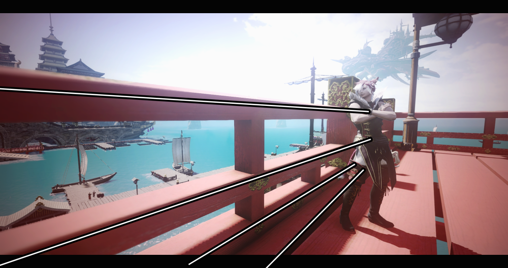
The guard rail (or fence) naturally leads to where my character is placed from this angle. Even the railing in the background directs attention towards where he’s positioned, drawing attention in once more to the right side of the image, as once again, we see the Rule of Thirds at work.
TIP! Fences are great ways to practice leading lines in your photos. They’re easy to find throughout Eorzea and provide a steady line that can be manipulated without too much difficulty.
So, as you can pretty easily gather at this point, a lot of these concepts and principles are going to overlap. Don’t, however, feel as if you are bound to these suggestions like a ball and chain. You are free to take photos in the way you like — even if it means breaking these rules entirely — because what I covered today is simply that: suggestions. Take them with a grain of salt, or twenty.
And if you do choose to put some weight into these suggestions and incorporate them into your photo sessions, I do assure you that they will become second nature after some practice. You’ll eventually place characters or visual elements within the Rules of Thirds grid without even thinking about doing so, or even toggle the depth of field with just the thought that you want something more or less focused upon and nothing more. It gets easier, and faster, but the only way you’ll get there is through practice, practice, practice!
Congratulations, Eorzean! You’ve survived yet another lesson and gotten to the end of what I consider to be the tutorial phase of Group Pose. You now know how it works, the foundation of how to better manipulate it through its extended settings, and what many photographers agree to be the principles that make up a good photo. You’re now free to roam with your camera, armed with new knowledge, to experience your new disciple class. Or, well, freer than you were before.
Quest Completed!
Up Next: Lights, Camera, Snaption!
In the near future, I’ll be showing off how I set up my shots, as well as introducing you to the wonderful world of ReShade. Until next time, and may your ever walk in the light of the crystal!